


 A review by Scott Bachmann.
Strange Attractors
I met Charles Soule at C2E2 when he was featured at the Archaia Entertainment booth. We chatted a bit as I flipped through his OGN Strange Attractors, and I liked the concept enough to buy it on the spot. Now I’ve read it, and I can assure you it’s worth the investment.
First of all, it’s an embossed hardcover. It just feels good in the hand. (Try that with digital.) The art by Greg Scott is perfect. It feels like a movie unspooling with clever camera angles and expressive faces – important, because this is a thinking story not an action story. New York City is featured as both a setting and a character and Greg captures both her grime and opulence perfectly. The colors by Art Lyon & Matthew Petz do an amazing job of making the important moments stand out by using limited palettes on them, while making the rest of the scenes feel vivid and real. The colors are muted, not gaudy, until the effects kick in and then they pop with power.
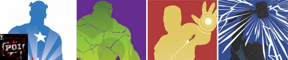
The story is a slow burner that pays off. It’s paced like a good hard science fiction novel, and its power is in math – harnessing patterns and complexity to stave off chaos inherent in a system. In a way, the TV show Person of Interest works the same ground, but where that show uses a computer, this story has the algorithms in the mind of an observant professor. The computer in PoI sees the patterns, but the protagonist in this story harnesses them, he keeps the complex city working smoothly. This makes everything more personal and the toll for doing it even higher.
The stand out art is the maps and representations of the math theories expressed. There’s even a gatefold moment hidden in the book that leaves you in awe of Robert Saywitz who designed the maps. Maps aren’t normally a selling point to a book, and math isn’t a sexy super power, but this book makes it work. You feel like you have your hand on the pulse of the city, that it’s alive, and you feel it when the angina kicks in.
This was a tough concept to pull off, and the book is a love letter to New York, which in itself is tough to do. If you sat back and said, “Hmm, what are the hardest things to portray in a comic and let’s do that in a book,” you’d begin to see the magic trick this team has pulled off gracefully.
This won’t be everyone’s cup of tea, and that’s ok. Much like any Vertigo title or Archaia title it is not for the mainstream Avengers or Batman fan. For those readers who like a good story but don’t need capes or zombies to carry it, those readers will love it.
Writer: Charles Soule
Illustrator: Greg Scott
Cover: Dan Duncan
Colors: Art Lyon & Matthew Petz
Letters: Thomas Mauer
Maps: Robert Saywitz
If you are interested in contributing to Drunk on Comics with your own review of a current or older colmic, please contact us via Facebook or email us at DrunkOnComics@Gmail.com
Scott Bachmann writes his own comics and novels over at
ScottComics.com